


Americana Elixirs Beverage Company
Enhanced authenticity.
BRAND IDENTITY BRAND DESIGN COPYWRITING PACKAGE DESIGN PACKAGE ROLLOUT
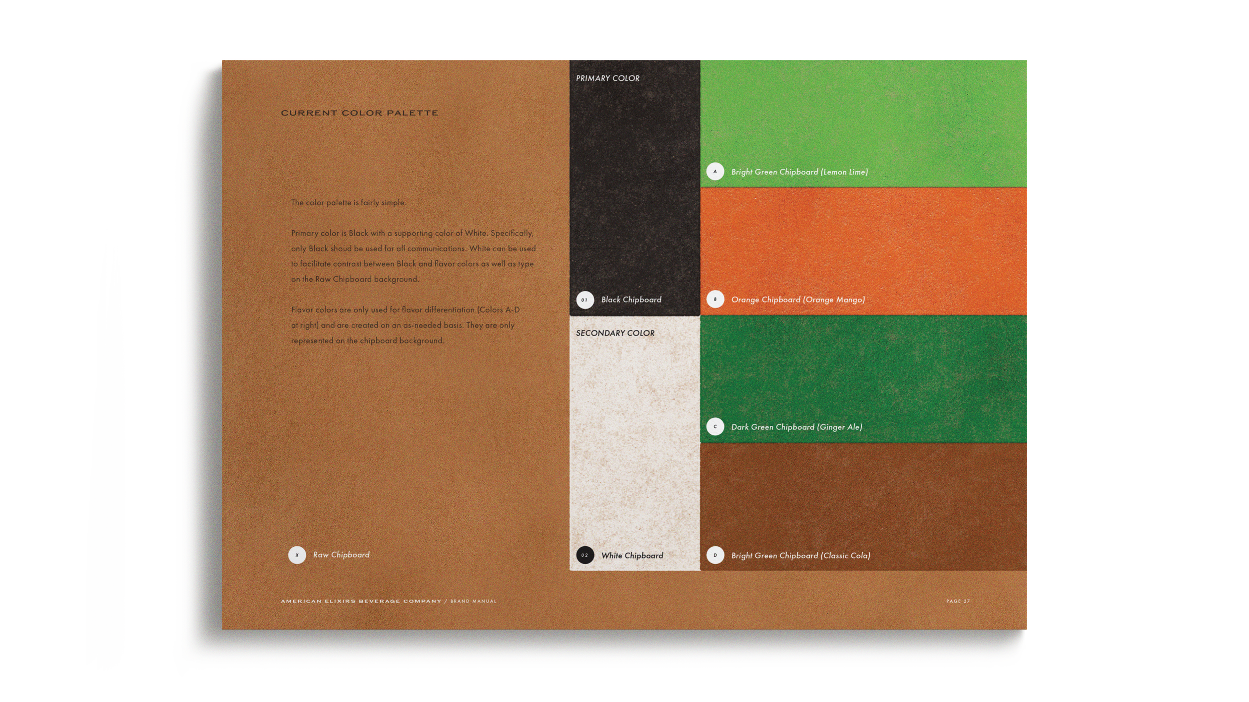
The rapidly growing functional botanical RTD beverage market has already generated a clichéd visual identity for the category. Clean, white, bright accent colors, and looking more like alcoholic seltzers than trying to carve out new ground.
—
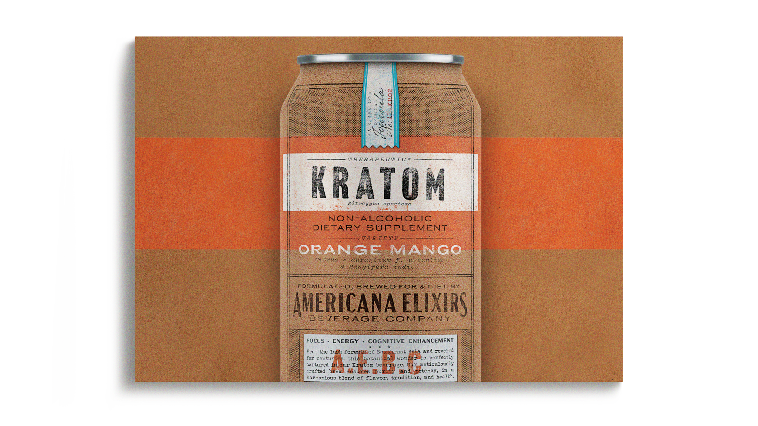
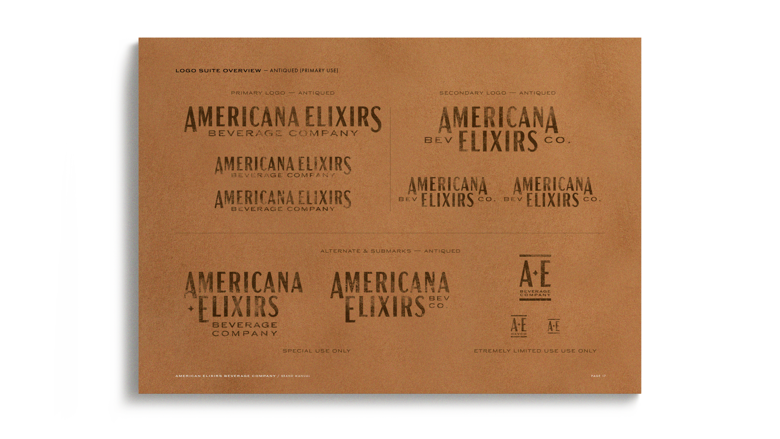
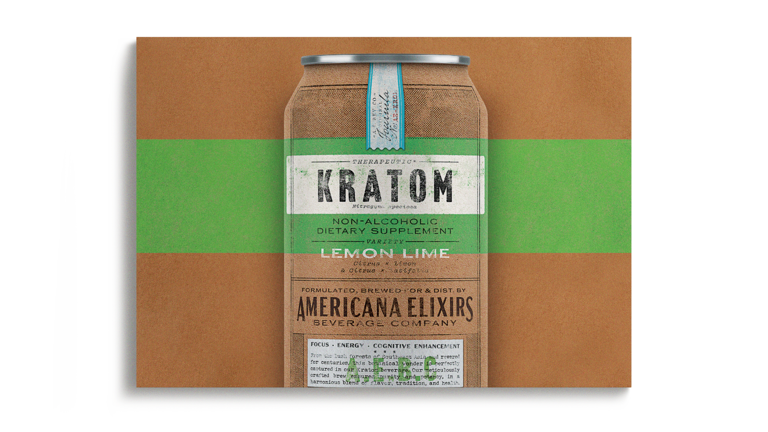
Americana Elixirs was named with the intention of creating a brand that is inspired by and ultimately leans into the history of naturally sourced botanicals, “crude drugs”, and compounded medicines at the turn of the 20th century.
—
This vernacular is carried through from the logotype to the simulated printing and labeling techniques as well as the writing style of the period.
—


—
The effect is multifold. First, there is immediate shelf pop, ingredient and flavor pacing, and fast credibility for a new entrant in the market.
—
Additionally, the packaging sets itself apart from the blurred lines of crossover category tropes.
CREATIVE DIRECTOR: MICHAEL WILSON
ART DIRECTOR: BRADY BONE
DESIGN: BRADY BONE
PRODUCTION: BRADY BONE
AGENCY: COPPERGATE DESIGN