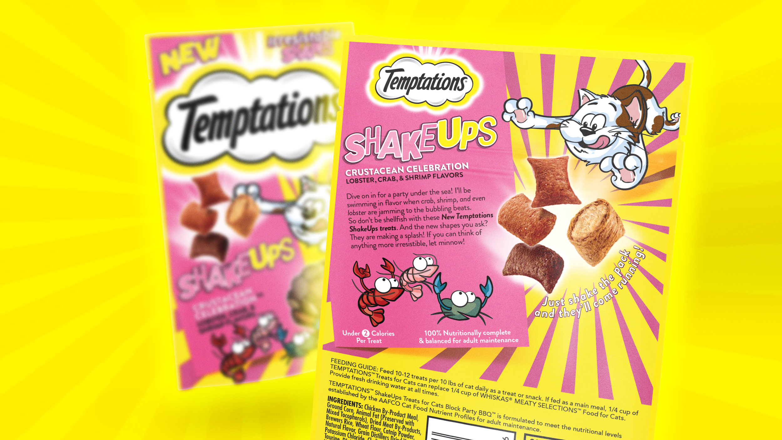
Temptations

Launch a sub-brand to shake things up.

STRATEGY RESEARCH BRAND IDENTITY BRAND DESIGN COPYWRITING ILLUSTRATION PACKAGE DESIGN

Temptations has held dominion over the cat treats aisle for years.

As such, the core product remains untouched — even as competitors are clawing at their lucrative market. Add to that, the patent was expiring. How do you maintain your lead AND bring new, younger customers to the brand?

You innovate on innovation.

Temptations was preparing to launch a sub-brand with new flavors of their crunchy outside, creamy inside treats with technology that allowed them to create fun shapes. The ask was to break free from the current branding on core and create excitement for the brand and the ShakeUps sub-brand.


The final touch was utilizing spot Metasheen on press. This allowed accenting color and elements to create a shiny, jump-off-the-shelf effect and a product window that wouldn’t be feasible otherwise with a metalized flexographic SURP.


Beyond the striking, brand-blocking yellow, bright variety colors, quirky flavor icons, and — of course — Jester Cat, A key ingredient of the Temptations brand is the back-of-pack copy. It’s fun, loose, and yes, a little silly, but writing copy for Temptations is as indulgent as the brand itself.

The successful launch hit or exceeded multiple KPI targets including, penetration, overall brand-share, and initial sales goals.

CREATIVE DIRECTOR: BRADY BONE
ART DIRECTOR: BRADY BONE
DESIGN: ANNA SCHECTERSON, BRADY BONE
ILLUSTRATION: LUCILE FROEHLY
PRODUCTION: BRADY BONE
ACCOUNT MANAGEMENT: ERIKA RASILE

AGENCY: TEAM CREATIF USA